
Work / EMV® 3DS
Designing the moment payments feel safe
UX guidelines for payment authentication, now used by banks, merchants and card networks worldwide.
- Role
- Product designer
- Client
- EMVCo, with Ipsos
- Shape
- Two engagements, about six months each
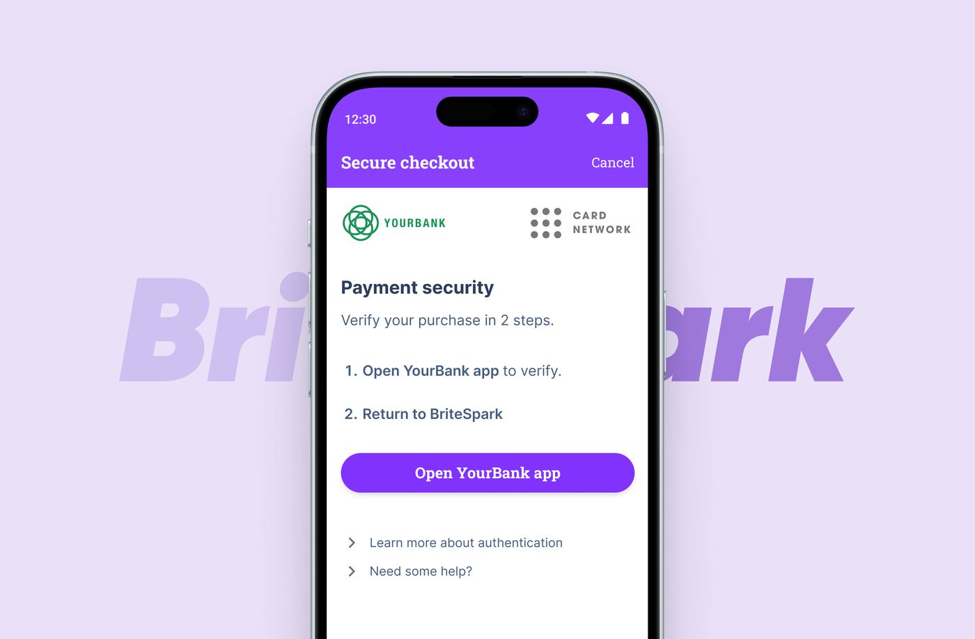
What I did
- Designed for the person mid-purchase, keeping every flow, screen and word focused on reducing anxiety at the moment of authentication
- Helped build a multilingual design system so one template family could serve 20 flow variants and 80 test prototypes without drifting off-standard
- Sat in on user testing across both engagements and turned findings into design changes, sometimes between sessions
- Helped shape the research into the published UX guidelines, and updated the live site for the second edition
Where it landed
- A single, evidence-backed answer to how authentication should look and behave, adopted as guidance worldwide
- Guidelines that live as an interactive web product rather than a report nobody opens
- emvco.com/3ds-guidelines
The three seconds that decide a sale
You're buying a coffee machine online. You hit "Pay" and a screen appears asking you to prove you're really you. In those three seconds you either feel reassured or you feel suspicious.
Three parties sit behind that screen. Merchants want conversion. Banks want security. Card networks want both. The person buying just wants their coffee machine, without feeling scammed on the way.
My focus throughout was that last person. Every decision came back to one question: does this make someone mid-purchase feel clearer and safer, or more anxious?
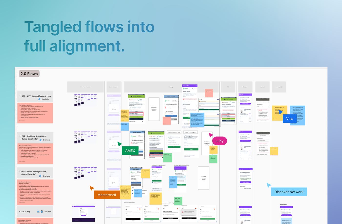
Mapping the territory
In workshops with EMVCo I helped map all 20 payment flow variants. Visual journey maps got six competing card networks aligned quickly, because everyone could point at the same thing.
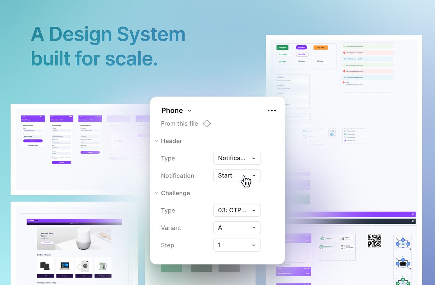
Most flows differ only by authentication method: a one-time passcode here, knowledge-based questions there. So the real design work wasn't in any single screen. It was a multilingual Figma design system flexible enough to spin up 80 prototype variants across six markets, and consistent enough that none of them drifted off-standard.
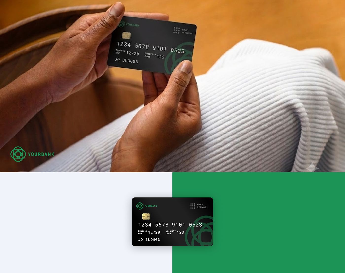
Real logos made people relax. So every bank, card network and merchant in the study was fake.
Designing honest tests
Recognising your own bank calms you down, which corrupts the data. To recreate genuine payment anxiety, every party in the study got a fictional brand. Even the cards were fake.
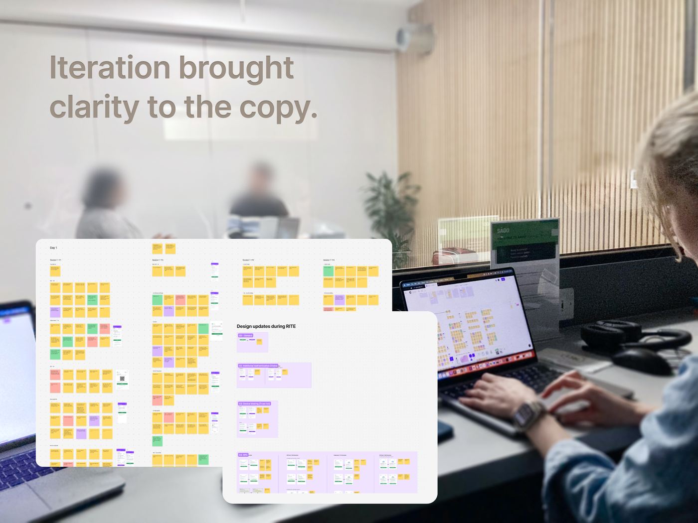
The first engagement validated existing flows with coded prototypes: realistic, but slow to change, so we piloted, updated, then ran full testing. The second explored unproven flows in Figma, which let us adjust copy and interactions between sessions as findings came in.
Copy as UX
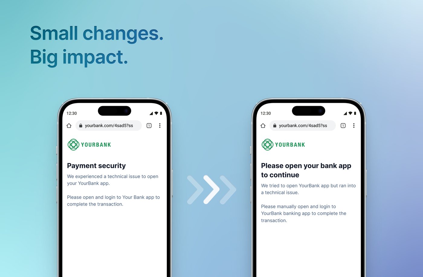
The smallest words carried the most weight, especially on unhappy paths. A payment failing mid-purchase is exactly when someone needs calm, clear instruction. With Ipsos' researchers I helped test and refine every notification and error state, front-loading the key details for scanning and clarity.
What it all came down to
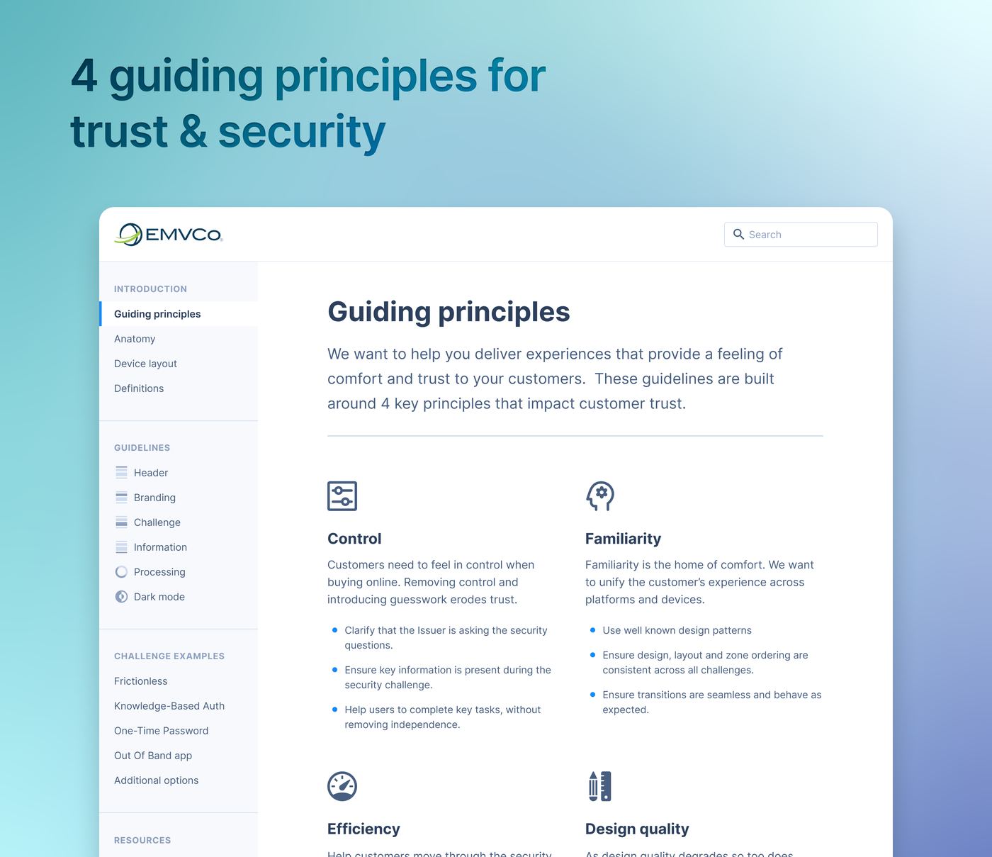
Across both engagements, every finding kept resolving to the same four things. A challenge earns a customer's trust when:
- Control stays with the customer.
- Familiarity makes it feel expected.
- Efficiency keeps the purchase moving.
- Design quality signals it can be trusted.
From research report to living guidelines
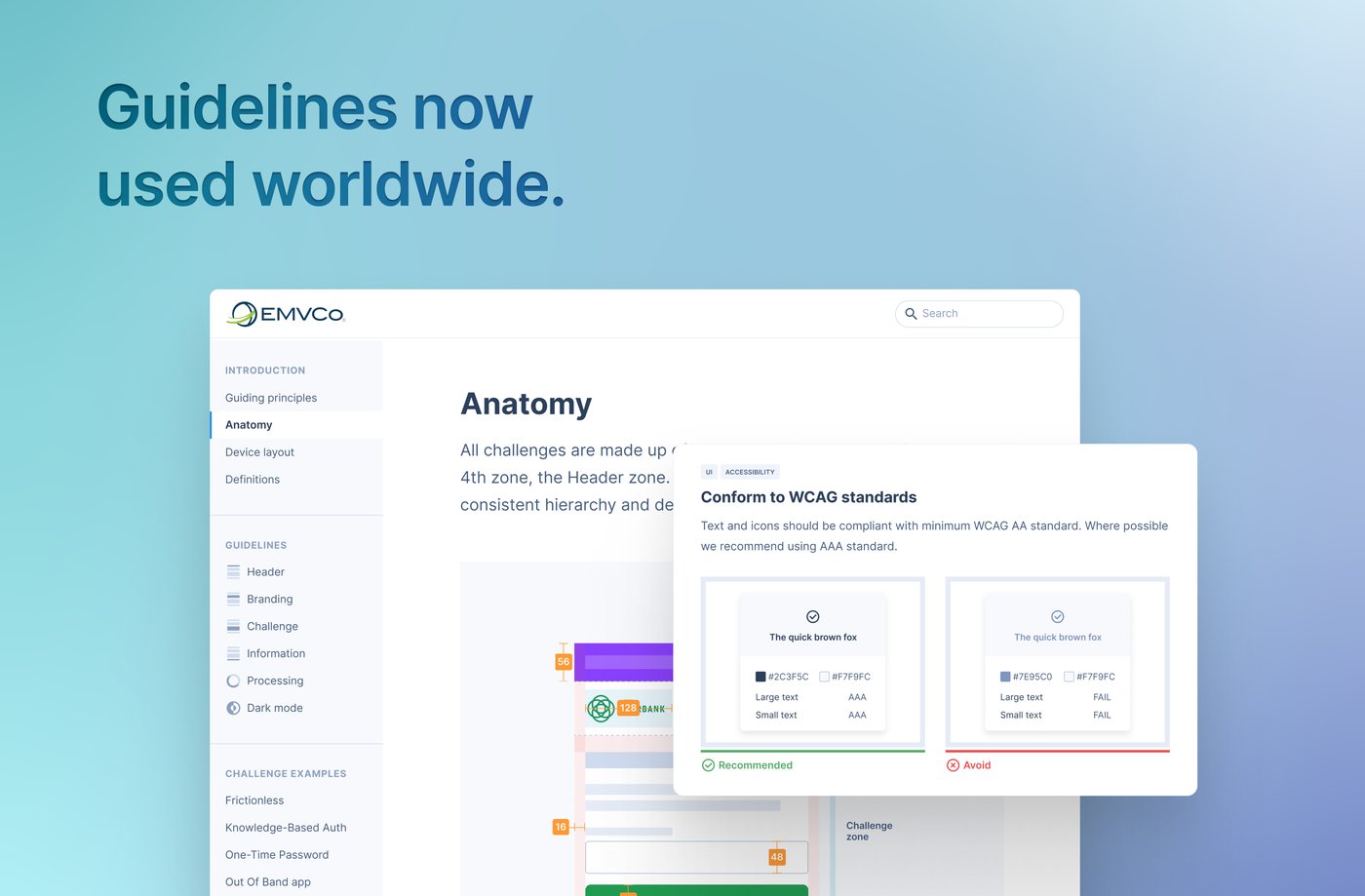
Research at this scale produces mountains of findings that usually die in a PDF. Instead they became an interactive guidelines site, navigable and rich with prototypes.
This was often the longest part of each engagement: taking the Ipsos reports and shaping them into clear, usable guidance. For the second edition I made the template updates to the live site and published the revised recommendations.
Guidelines, applied
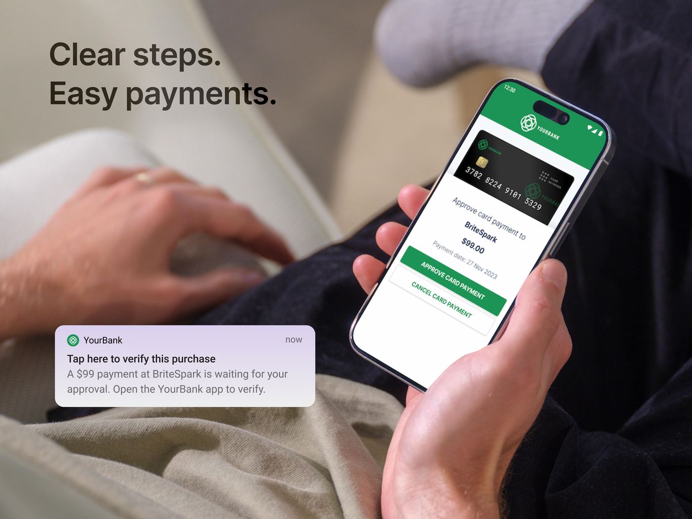
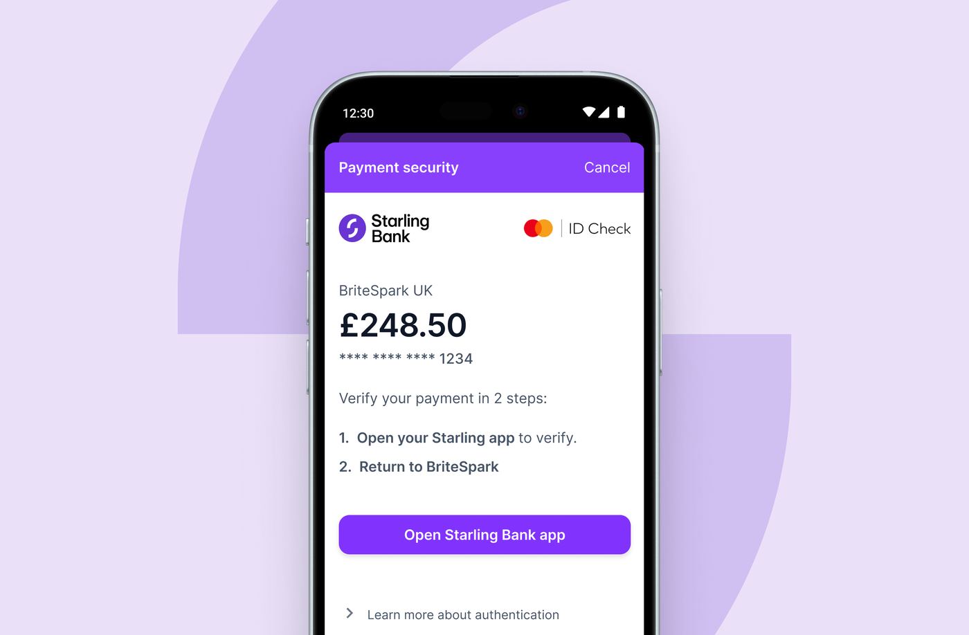
The test of a template is what happens when a real brand moves in. The anatomy holds from research brand to real bank: same zones, same two-step structure, same hierarchy.
The takeaway
The right amount of friction isn't zero. In testing, a pause of three to five seconds worked best. When security is on someone's mind, a well-designed pause builds trust. Complex systems don't need to feel complex. They need to feel considered.
Say hello.
Got a product that's harder to use than it should be? I'd love to hear about it.